And this is why the requirement has increased to pay extreme attention on the usability of e-commerce websites. This is because the customers who wish for online shopping, they desire for the quick, easy and convenient process.This post deals with some tips which can be useful in making the e-commerce websites more usable and thus providing customers a noteworthy experience. Keeping this point in mind we are presenting here most usable tips which can assist you in the creation of usable e-commerce checkouts and shopping carts. Cross check these tips and implement these in your next e-commerce website. We hope it will prove beneficial for you.
Full page and Mini carts
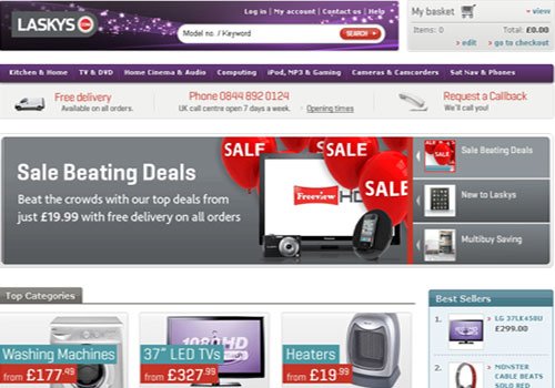
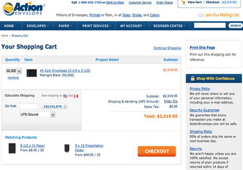
Most of the time you have seen that some of the shopping carts comes as a fully functional cart that is contained within a page of its own while many others appear as a “mini” shopping cart, usually located in the sidebar, or above the page fold. It is advised that an e-commerce site should include both form of shopping cart presenting option in front of customers to choose either of choice. While, full page shopping cart provide more information and options as compared to the mini cart. On the other hand, mini shopping carts show only precise information within a small area that doesn’t take away from the rest of the layout. When anyone selects any item, it is immediately shown in the mini cart and when shopping is continued, the details minimize and only the number of items and total price is shown in the cart. While in full page shopping cart, information such as product details, remove/edit items, tax prices and shipping options, all are shown. One can also switch from the mini cart to view the full page cart through the link provided. Let us see example of both the form of shopping cart as shown below:
Mini Shopping Cart:
Full Page shopping Cart:
Checkout: Step-by-step or one page
The second important thing which is of prime concern is structuring the checkout process either step by step or in one page. Although using a step by step method makes the checkout process easy for the customer to follow, but still most of the e-commerce sites also follow one page checkout process. If we will take a look over Apple.com checkout page, we will find that, the site has performed the step by step check out function in four different steps, i.e. Sign In, Billing & Shipping, Payment and finally Verify or Edit.
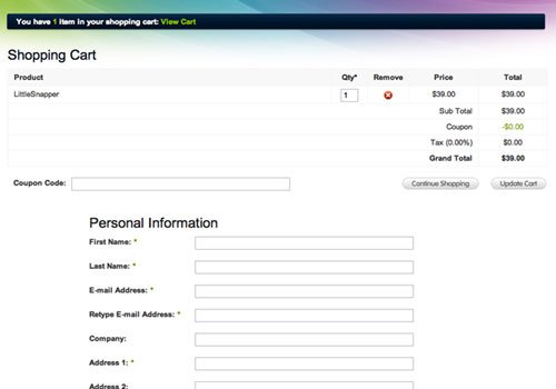
Another alternative to the step by step process is the one page process, i.e. keeping the shopping cart, personal information and shipping/billing information on a single page. This alternative works well if done with a good looking layout. For example: Have a look over the below presented site that uses a good single page checkout process showing table at the top containing the cart, along with the purchase information forms below. This is really looking awesome.
Link from mini cart to full cart with an icon
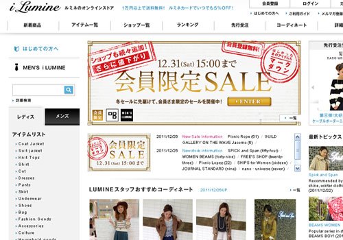
As we have described above regarding mini cart as well as full page cart, here it is advisable that if a site is including both the form of cart, there must be a link between the two, and that too with the help of an icon so that clicking on the icon can reach to the either cart, i.e. clicking on the mini cart may lead the user to jump to the full cart and icon should appear there alongside so that the customer can once again switch to the mini cart as per desire. while building the shopping cart, it should be noted that this type of linking add several subtle features that impact the customer’s experience. The below presented website is an excellent example to this.
Make checkout/add to cart buttons obvious
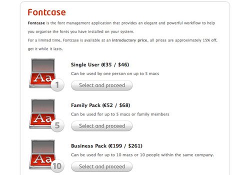
The other important tips to be kept in consideration is the addition of “Add to Cart” buttons on the e-commerce websites. The “Add to cart” button should be large enough and should contain clearly legible and understandable text, so that it must draw attention of the visitors visiting the site and approach them to continue the check out or shopping. Not only that, the “Add to cart” buttons should be styled in well manner and should be placed in such a position that it directly can appear under the information of each product and can be visible to the customers. If the customers will not find the check out button and be well convinced, they can’t buy the product.
Use a readable table based layout
While designing a full shopping cart, it should always be remembered that the layout of the table which you are going to use must be in readable form and tempting to the visitors visiting the site. It is advisable to always use table based structure and standard fonts avoiding the use of complex backgrounds. The experts in the concerned field says that one should always make sure that the shopping cart should be clean containing all the necessary elements; strong borders must be used in the table to separate cells and also one should not forget to include the image of the concerned product. All these in turn assist the customers to confirm that they have got what they were searching and thus tempt them to purchase that very product from your site.
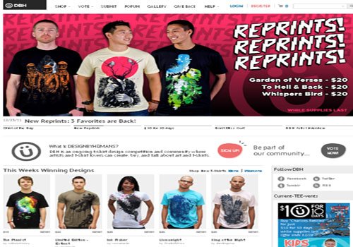
Continue Shopping link
One noticing thing that should be remembered while designing for e-commerce website is putting the link of “Continue Shopping” button which when clicked can bring the customers to the store and catalog where they can easily find the products they are searching for. This results in the increase of conversion rates.
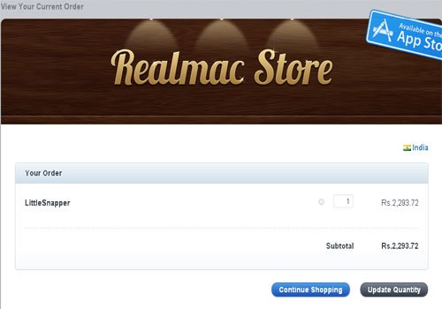
Avoid too many fields
Most of time you must have seen that many of the sites use bulk of fields which confuse as well as annoy the customers to fill out an unnecessary amount of input fields in a form and ultimately led them to switch to any other option. So it is suggested that putting too many fields in the shopping cart should be avoided because the customers do not find such a form convenient and thus this can stop them to visit your site again next time. Thus it should be attempted to put minimum number of input fields on the form and that too in organized form. Let us see the following form as shown below, which contains a small number of input fields and thus is a perfect example of minimalism.
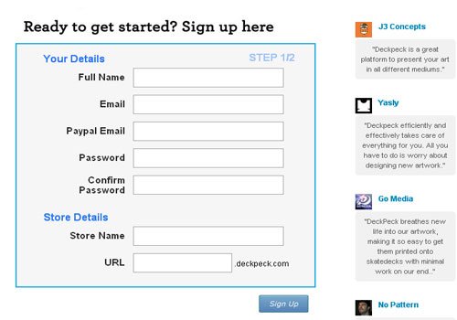
Provide plenty of help elements
It is regarded as good practice to provide plenty of help elements, such as, quick tips on how to best use the cart’s features, explanation of checkout process etc on the website. The checkout form page should also include sample text clearly indicating what should be included in each input field so that it can properly guide the customers and avoid them for having any confusion. This attempt will leave an impressive effect on the customers and they wish to visit your site again and again for purchasing any products. Look at the form which we have presented below to learn how it has showcased input fields having explanatory sample text along with some additional helpful information.
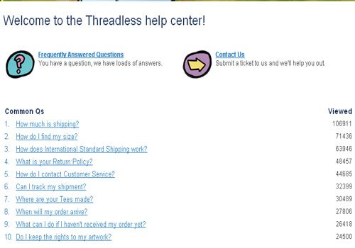
Give Visual Support
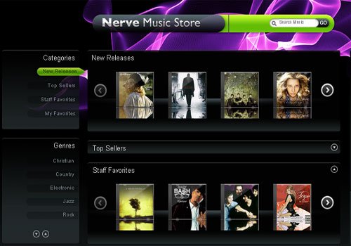
As we know well that pictures speak much louder than text and thus are more convincing. Thus it should be noted that one must include visual support while designing for e-commerce site, either it may be any diagrams or simple icons. For example we can consider that, an image showing the location of an account number on a credit card assists customers in knowing that they are now entering to their billing information. Have a glance over the below presented site which shows a very convenient click and drag cart telling customers that they can drag items into the cart and in this way effectively convincing customers about what to do.
Always Include a Verify Page
The last but not least feature of any e-commerce website is the verify/edit page, which is also the final stage for online shopping. This step is quite necessary one as it offers opportunity to customers to review their order before completing the payment process and in this way enables them to verify or confirm that whether they are buying the right product. Thus, it occupies immense importance in any checkout page and hence should be taken care of.

Comments
0 comments