Apart from visual design elements, a web designer can also prove his creativity with the layout of the site – the structure and the way the information he is presenting in his website. If you are a web designer, you might be thinking how it can be done, how you can prove your creativity. In this post we have come up with some interesting ideas along with 30 proven websites that will show you how exactly it can be done.
These days, a craze for designing more individual and customized websites with outstanding layout is seen among web designers or developers. There would be no doubt to say that the website designed with astonishing layout seve the purpose of delivering individuality and personality to site that even faceless, shiny, glassy 3D-buttons completely fail to deliver. In this post, we are presenting top 30 smart and cool websites with creative and unique layouts. These websites use realistic motifs from everyday life, such as hand-drawn elements, script fonts, pins, paper clips, organic textures and scrapbooks. Check out these websites, learn from these, and give a human touch to your work of website design and show what you are capable of in a truly distinctive manner. We hope you will find some creative ideas for your future projects.
Also do not forget to share your thoughts with us by dropping a comment in the comment area. We get inspiration from your valuable comments.
Sitotis.hr
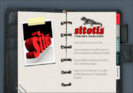
Sitotis.hr is an eminent website having excellent look and layout. The background image for Sitotis is a binder that contains the content of the page and the tabs in the binder are used for navigation.
![]()
Basil Gloo
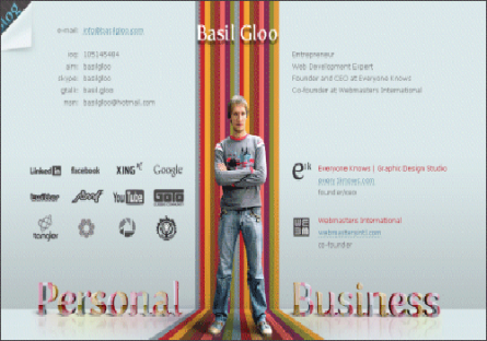
Basil Gloo is a website which is designed by popular web developer Basil Gloo who has used an interesting layout on his homepage that separates the page into a left and a right side. The left side contains his personal information and the right side his business information.
![]()
CraigEarl.co.uk
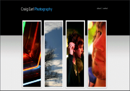
CraigEarl.co.uk is designed by photographer Craig Earl who uses a layout that features four tall and narrow images that link to different categories of photos in his portfolio: everyday, landscapes, bands, and people.
![]()
Huge
Huge is a well known design company uses a large image on the left side of the homepage with the primary navigation and content in a narrow column on the right.

![]()
Interview Magazine
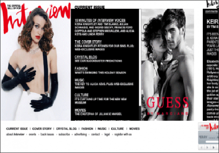
Interview Magazine is another website which horizontal layout and presents a different visual impression than other online magazines.
![]()
The Horizontal Way
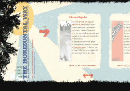
The Horizontal Way as the name signifies naturally uses a horizontal layout itself. It impresses its visitors due to its excellent use of layout in fashionable manner.
![]()
Swiths.com
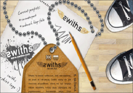
This is an interesting website which uses a large background image of a wood floor and a guy’s feet; the content of the site is on a piece of paper and a notepad lying on the floor.
![]()
Davor van Eijk
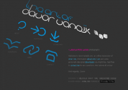
Going through the homepage of this site, you will find navigation in the center of the page on an angle and the content of the page is in the lower right hand corner.
![]()
Ribbit.com
The layout of Ribbit.com website features a large background image of a man sitting on the grass. The sky in the picture becomes the background of the page and the picture totally reveals how it interacts with the layout which is really one of the facts that give the page a unique feel.

![]()
BootB
BootB site uses a black background and some drawn clouds at the top of the page. The center of the page contains navigation in a circle that is part of an image of a hot air balloon that is about to float to the clouds.

![]()
Vesess
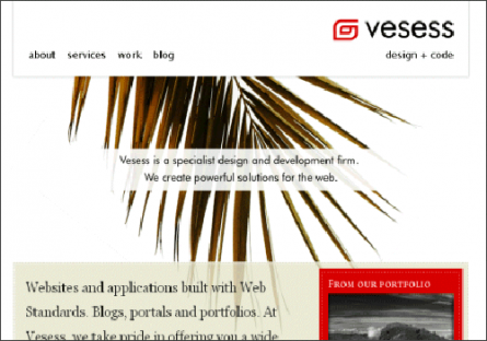
Vesess uses a simple header that includes navigation and which then goes into an image right at the focal point of the page. If you will scroll down you will see the use of a few columns for some basic information.
![]()
Dinulovic.com
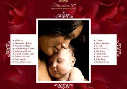
The Dinulovic homepage uses an image at the center of the layout with navigation on both sides and does not contains any real content.
![]()
Alexarts
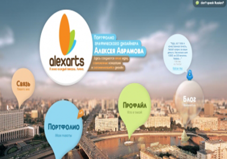
What’s a unique layout of Alexarts, really it is worth noticing. The background image of the website add more charms and beauty to the website
![]()
McCormick Creative
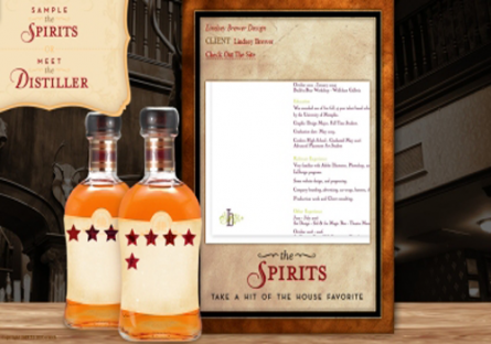
McCormick Creative is an elegant website designed by PJ who is passionate for designing web sites, brands, applications, logos, and other useful things. When you will go through this website, you will find the entire site is different parts. The layout of this site is really awesome and might impress you.
![]()
Tangled Decals
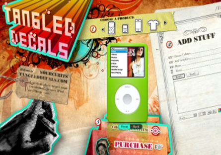
Tangled Decals is an interesting website which has made use of attentive layout on this homepage that separates the page into different section containing necessary information of the site.
![]()
Colourpixel
This website is designed by famous designer Nag, a designer from Hyderabad, who is passionate of web, print, identity, branding, and user interface design. The layout of this website is different from other websites which seems to be categorized into three different sections in ladder form.
![]()
![]()
Howarths
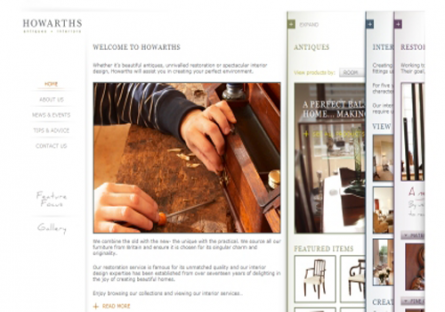
Howarths is an elegant website of Britain and is service provider of interior designing, antiques, unrivalled restoration etc. Whatever service is provided by this site reveals form the design layout of this website. The homepage of this site include an image gallery which displays the images of all those things which are included in the service of this website.
![]()
Rabotilnica
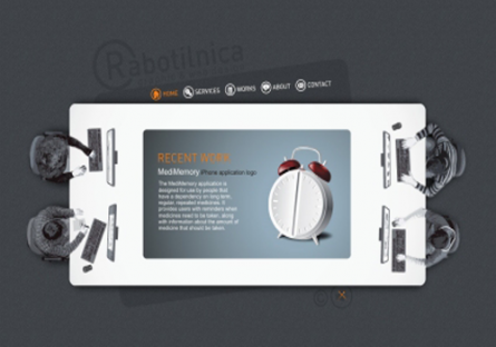
Rabotilnica is a small creative website which aims to offer a variety of services: basic website design, application development, complete e-commerce website development, corporate identity (logo and stationery design), brochures and prints. This website is created by skilled experts and professionals who are committed and highly competent personas with number of years of experience which you can easily catch up from the design and layout of this website.
![]()
Ashes & Milk
Ashes and Milk is another beautiful website with stylish and eye-catching layout. Its layout seems to be designed in wooden pattern.

![]()
Jack Threads
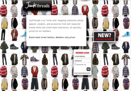
Jack Threads is a fashion website showcasing various fashion products for guys. It is an online shopping community selling apparel, shoes, and accessories from top tier street wear and contemporary fashion brands. When you will go through this website, you will definitely appreciate its layout, texture, gradients and everything.
![]()
Missscha’s Photogallery
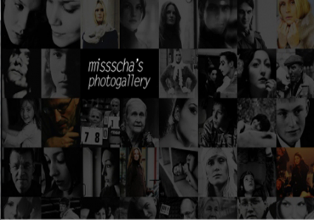
Going through this site, you will find a photo gallery containing number of photos in the thumbnail forms, clicking on which you will navigate to its full snaps.
![]()
Jan Sochor Photography
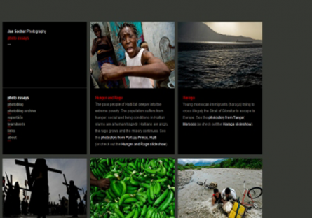
Jan Sochor Photography uses a unique layout categorized into several sections. We hope you will certainly like the amazing layout.
![]()
X Producciones Graficas
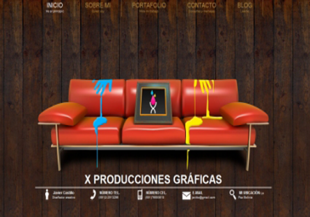
The X Producciones Graficas website is a rocking website that uses a horizontal layout and a navigational scheme and a photo gallery, where the visitor slides across the site when using the navigation rather than being taken to a separate page.
![]()
Creative People
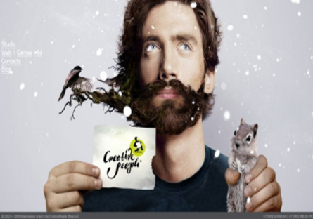
When you will carefully see the site, you will find that that in the background image of this site is a man catching a squirrel in one hand in other hand a logo or label like card of creative people and seems that some of the part of this card has been eaten by squirrel, on the left corner contains the index of the contents; all these signifying some unique meaning to the visitors. Overall the layout of the site is excellent.
![]()
Katy Watson Kell
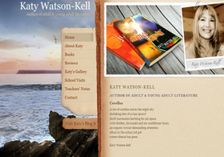
Katy Watson Kell is the blog website which contains blogs and articles of Katy Watson Kell, an author of adult and young adult literature. The gradients, texture and contents of the site are arranged in superb manner that it overall makes the layout of the site perfect.
![]()
Get London Reading
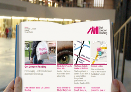
Get London reading is a website, as the name suggests, it is a rough guide to London encouraging Londoners to make more time for reading. The layout of the site is really nice and seems to be a person taking a book in his hand. The content of the site seems to be divided into three column, each column containing different contents.
![]()
Rin-Wendy
A blog site with a different twist, Rin Wendy leads the visitor through a series of different sections of one page that include several blogs on two sides in middle of the index. As you click on blog title, you will slide to a different section of the page.

![]()
Bullet PR
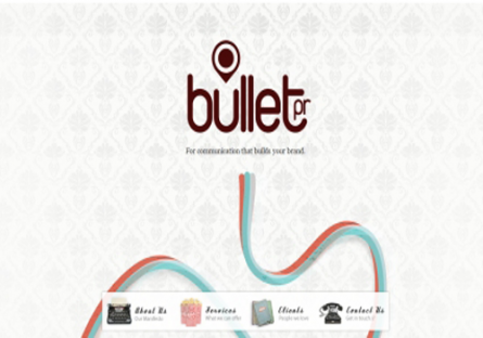
Bullet PR is a unique website which specializes in Public Relations for the arts, music, fashion, creative and travel sectors. The layout and texture of this site is superb; the site aims to delivers creative PR campaigns designed to get you noticed.
![]()
Bert Timmermans
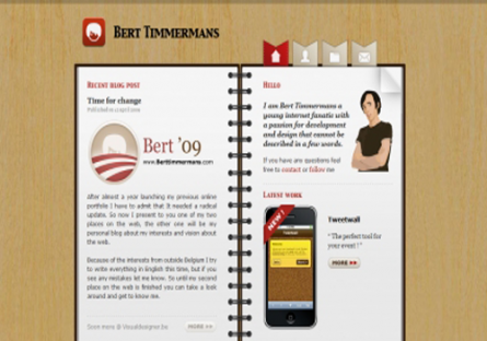
Bert Timmermans is the home of Bert Timmermans a young internet fanatic having a passion for design and mobile. What makes the layout unique is the background image of site holding the content of the page. The layout of the site is in diary form which seems to be holding the content of the site in left and right page.
![]()
Serial Cut
Serial Cut is a website with unique layout and elegant background image; the content of the site appears to be on the left side of the website.

![]()
