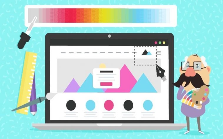
Bold colors may either intimidate or intrigue. Soft shades, on the other hand, are associated with safety, but also monotony. Hence, careful selection of your website’s graphic design may influence further decisions of a visitor. Use it for your advantage and make your page appeal to your prospective audience, color-putting them in a “feeling good” type of mood – and making them credit your site for it.
What is the color for you?

First things first, one color alone rarely does the trick. The key to getting that visitor to stay is to combine a set of different shades for one color, or go for a few distinct ones which complement one another and work well together. The main idea is to adjust the color palette to the type of content and service you’re providing. For example, if it is a page that revolves around cozy house interiors, you will want bright, pastel shades of similar color which set the right mood right from the start. In case of a punk T-shirt online store, it will be the powerful combination of black and red or other strong colors that will make the potential buyer feel at home.
The psychology of shade
Each color evokes certain emotions and feelings. Therefore, you should not only make sure your website’s background suits its message, but also trigger the right mental spot. To help you through this daunting task of getting into your customer’s head, we have prepared a list of top used colors and their effects on a mind:
- red – it will attract attention to the issue you want to highlight. Don’t overuse it, though – too much red may be overwhelming and scare the visitor away
- green – associated with balance, calmness and nature. Good for everything eco-related or connected with health and biology. Be careful however, as it might also evoke the idea of sickness.
- blue – makes the visitor feel at ease and less distrustful. It’s especially useful when you’re dealing with a delicate subject and need to promote secrecy
- yellow – the color of sun evokes feelings of fun and carefree adventure. It’s perfect for selling something that is supposed to “change your life forever”
- grey – neutral and sophisticated, will appeal to serious website users. Works well if you need to win trust and respect or pose as an expert
Colors hardly ever go unnoticed by a visitor to a site – and even if they do, their subliminal effect on an unexpecting mind is undeniable. Triggering a person’s deeply-rooted needs, you are more likely to make a lasting impression and not only keep them on your site longer, but also prompt to come back in the future. Using a thought over mixture of strong colors or just different shades of one, you are bound to make your content speak to the reader even better. In short, all you have to do is just set out on the right color track and wait for it to win your target audience over.
About Author:
Angelica Jennsen is an experienced Marketing Specialist with vast IT experience currently employed by Seven Spots who divides her time between work and her passion for traveling and learning languages.


