Although Flash is a well known technology but nowadays it has lost some of its circumference and the entire focus has been shifted to the core technologies of the web such as HTML, CSS, and JavaScript. This is because HTML, CSS, and JavaScript are the basic language which is known to everybody and a large community of web developers or designers prefers to relinquish the payback of Flash for all these familiar and well adaptable core web tools.
Apart from these, there are several other reasons due to which the web developers and designers are moving away from Flash and massively shifting towards the core web languages. Although, HTML driven websites came on track as static entities but with the advent of AJAX like technologies has bring a radical change in the concerned field by enabling animations, transitions and interaction on the websites. Previously these things are achieved in the website through the use of Flash, but nowadays it can be effectively achieved with the help of AJAX and JavaScript.
We are hereby in this post presenting an ultimate collection of Pseudo-Flash website which looks like Flash driven websites but do not make use the Flash technology. In these examples you will see that how these websites pretend to be based on flash but actually are coded HTML, CSS and other core web languages. Check out the list presented below and strategically apply these approaches to enhance your website:
Flash Website
Emilie Crssrd
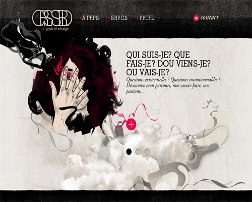
Emilie Crssrd can be taken as the perfect example of Pseudo Flash website because many things on Emilie Crssrd’s website make it look like Flash. It has the loading indicator which looks like something we would typically find on a Flash website, but here it is achieved with AJAX functionality. The entire website is designed in such a manner that the loader here, combined with the in-page transitions, make a smooth interface and the mechanism keeps images and un-styled content from popping in before they have fully loaded, ensuring that users see the content properly.
![]()
Stefan Kanchev
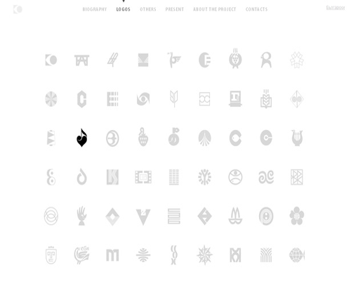
The subtle fade-in and fade-out of the icons as you mouse over them make for a beautiful interaction. The visual prompt helps users focus on one element at a time and a subtle fade-in and fade-out of the icons when mouse is hovered over them make for a beautiful interaction. These all is done in such an effective manner that it adds a bit of sizzle to bring this minimalist page to life.
![]()
Brand Republic
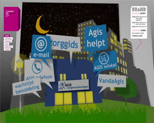
The design, interface and overall feel of the flash website is such that one cannot forget to appreciate this website after making visit on it or interacting with it. The CSS-based element, container around the logo, which has made use of the mouse’s position to dynamically alter the standard borders, creating a 3-D effect and ensuring the logo stands out against the intense background has a brilliant little interaction to it. It is the place where you see exactly what you want.
![]()
Cooper
Cooper with having smooth transitions, seems very much like Flash but do not make any use of Flash website and here everything is achieved with standard web languages. It follows a popular approach to single-page websites and as anyone selects items in the navigation, the relevant content rolls into the viewport. The website offers an excellent functionality though; the whole thing blows up on mobile devices.

![]()
Flipboard is quite simple website, and the thing what makes it utterly feel Flash like is how it scales. What makes this website feel very Flash-like is how it scales. The web page dynamically adapts to fit browser leaving a standard Flash like effect and possesses a pretty standard content rotator.

![]()
Crafty 2010
Crafty 2010 looks very much similar to Cooper’s website and also provides in-page scrolling like the later website. This is quite snappy website with cool animation and has maintained the balance between style and usability in a nice manner.

![]()
20 Things I Learned About Browsers and the Web
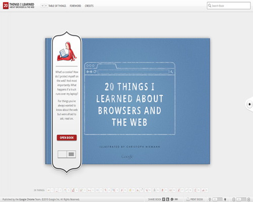
As we know that interactive page-turning is a popular effect on Flash website, “20 Things I Learned about Browsers and the Web” has shown the same functionality and behavior. It is really a serious piece of work and a brilliant example of a standards-based website demonstrating effects that were once possible only with Flash.
![]()
NL Engenharia
NL Engenharia is a typical website for an architecture firm and just fits the niche well. The design of this site will convey you the message like it must be literally transplanted on Flash. But you will be amazed to know that it is based on HTML. You will find everything such as the slide-out navigation, full-screen images, dynamic sizing, all hallmarks which can earlier used to achieve through Flash. The overall design of the website is appealing and represents the firm well.

![]()
Ryan C. Jones
Ryan C. Jones is a brilliant example of the fact that the core web technology cannot go into vein; it can standalone be used to design dynamic websites. Ryan C. Jones has a beautiful photography portfolio which has proved that without using Flash and with the help of basic web languages, a prominent website can be build with effective functionality.

![]()
Studio Gang Architects
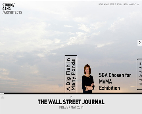
When you will look at this website page at a glance, you will find that the creative interface and animation on Studio Gang Architects look awfully similar like Flash. It has been build with good old-fashioned HTML, but still you will notice that its interface is unique and memorable demonstrating everything what can be achieved with Flash.
![]()
DIST Creative
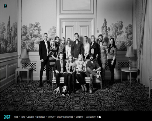
DIST Creative has surprised its visitors with its animations, loading indicators and fluid interface. The overall website combines the creativity of the best Flash website layouts with very usable HTML-based solutions. It is quite easy to communicate with this site and its navigation effectively displays the uniqueness of the company which is represented by this site.
![]()
Messages for Japan
This site can be a prime example of how aesthetic elements can enhance a standard website. When you will have a glance over this website, you will find that its look is not similar to Flash like website but the animation and special touches which it features makes the interface smooth and also interactive elements are so prominent that it has made it simple to use.

![]()
Bit Byte Bit
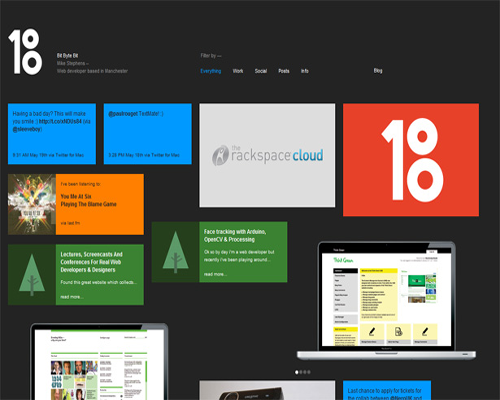
Bit Byte Bit is really an awesome example of Pseudo Flash Website which pretend to be similar like Flash website but have not used Flash technique. This unique site dynamically aggregates content from multiple sources, including the owner’s blog, Twitter feed and Forrst account.
![]()
FORM
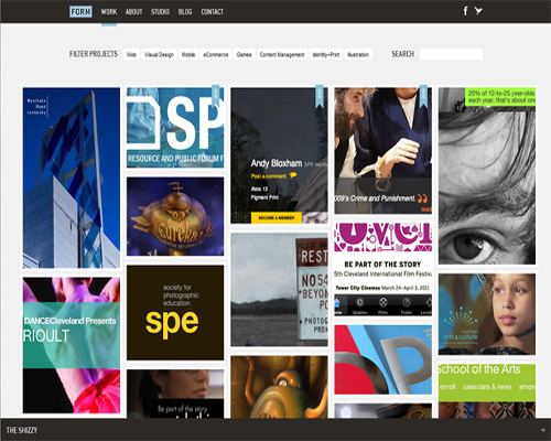
FORM is a wonderful site which follows similar approach as followed by Bit Byte Bit, but the differences between these two is that the former one is more image-oriented, having fully functional home page which is easy to use. The site effectively demonstrates its agency work with relevant content and images.
![]()
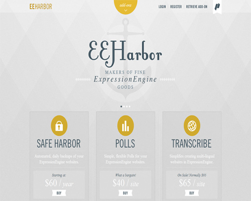
EEHarbor
Although you have seen many website, even here also explained many, which uses in-page transitions to change content without refreshing the page, but the way EEHarbour does it is really appreciable and appealing. The speed at which it loads its pages, fancy animations, and high-quality image presentation is some of the worth reason behind its huge success.
![]()
Flash Website
Please Share your Comments & Experience With us.
