A logo design is the signature of any business and industry. An impressive logo design pastes an unforgettable name of the company among the customers. Whether it is a curly ‘C’ of Coca Cola or long ‘M’ of Macdonald; logo designs have undoubtedly defined the identities of the business machines.
Logo designers are forcing their creativity beyond imagination to design artistic logo designs. Every logo design is related to the genre or origin of the industry. Some of these logo designs soundly appeal the relation whereas some logo designs encapsulates a hidden meaning.
To illustrate the creativity of the logo designers to design these amazing logo designs with hidden meaning; I am presenting a list of the top 15 examples of logo designs with hidden meaning.
My Fonts
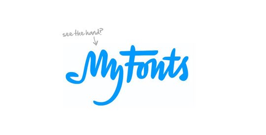
This impressive logo is a beautiful example of a custom made handwritten Logo design. If you put a spotlight on ‘MY’ part of the logo you can see a hand. This hand defines that the logo you are going to get designed by My Fonts will be compiled with your business statement. Moreover, if you revert the logo, you can see the ‘MY’ part turned into a dinosaur.
Yoga Australia
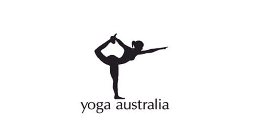
A girl stretching her body in a Logo design for Yoga; nothing special right? Lets see the hidden story of this amazing logo design. It’s true that at first glance this logo appears to be about a girl doing yoga but if you put a careful observation you can see the map of Australia (where she holds her leg). The impressive creativity to hold the nationality of the brand in the logo design is simply amazing.
Washington State University
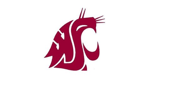
In this creative logo design of Washington State University the mascot of cougar is beautifully picturised. But the secret story of the design is in the design; if you carefully observe this logo you can see that this whole design is designed with the acronym WSC (Washington State University) cool right!
Cattle Yard
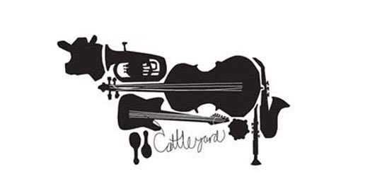
Cattle Yard is a popular name in the music related business and with this awesome logo design they had soundly proved their statement. In this logo design the company’s name is artistically assorted with the genre of the industry. Undoubtedly AMAZING attempt.
Zip
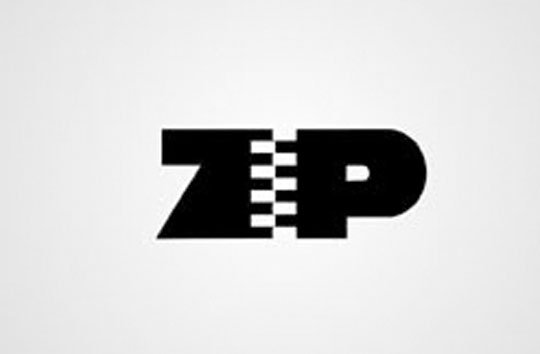
Simple yet attractive and meaningful. In this logo design of Zip; the character ‘I’ is replaced with a zipper that connects the letter ‘Z’ and ‘P’.
Marry Me
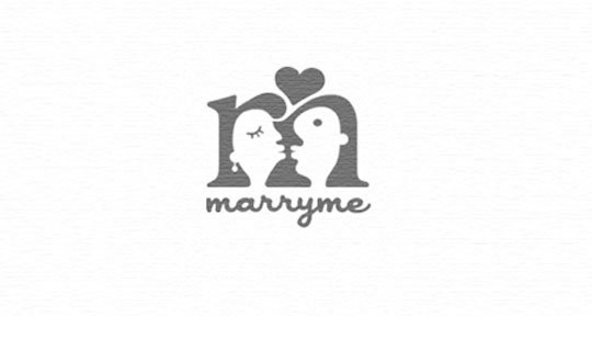
This logo design is one of my favorite choices. A couple in the negative space of letter ‘M’ is really awesome. The genre of the company is so beautifully presented in the logo design; I hope you too will be dazzled by this creative logo design.
Seeds
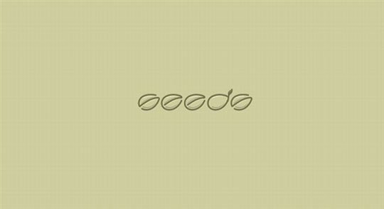
A few seeds for the logo of the company ‘Seeds’? Now see these seeds carefully and you will find the company’s name written in cursive fonts. Creative right?
Eight
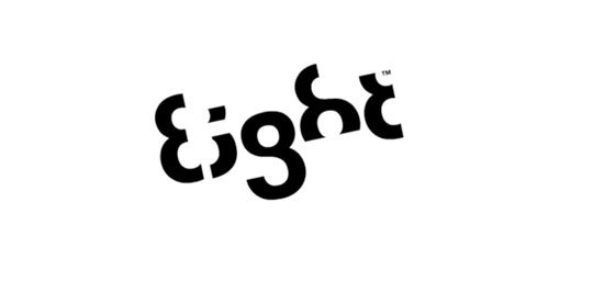
This logo design of ‘Eight’ is a beautiful way to design a logo using a single number; the number 8. This is really a creative thinking to design a character logo by omitting certain part of a numeric digit.
Mosleep
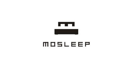
Mosleep is an organization of doctors who deals with the patients who had issues related to sleeping problems. Never heard? Don’t worry you will remember this term after watching this impressive logo design. If you put a limelight on the design you can see how creatively the designer has used the letter ‘M’ to appear as a bed.
The Pittsburgh Zoo
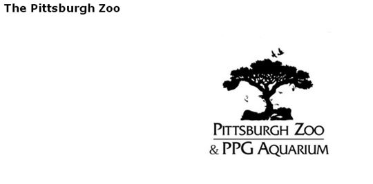
This hidden meaning logo design of the Pittsburgh Zoo is a perfect synonym of ‘Ultimate Creativity’. The logo design is themed on the wildlife; you can clearly see a tree and some birds but if you put a spotlight on the design you will see a gorilla and a tiger facing each other. This design forces me to shout ‘how could someone be so creative?’
FedEx
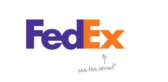
The logo design of FedEx is one of the best examples of negative space logo design. If you carefully observe this logo you can see an arrow in the negative space between the letter ‘E’ and ‘X’. This arrow symbolizes the core working principal of the company that is ‘speed and precision’.
Toblerone
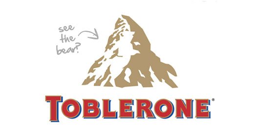
Toblerone is the one of the most popular swiss chocolates. Beside with the unmatched taste; the logo design of this brand too has an interesting taste. The hidden bear in the snow of the mountain symbolizes the origin of the brand. The portrayed mountain is located in at the border of Switzerland and Italy but what about the bear? Actually Toblerone was originally manufactured in the town of Bern and Bear is the symbol of that town.
Vaio

The cursive fonts of Vaio had encapsulated a hidden meaning Logo design. The combined cursive letters ‘V’ and ‘A’ represents an analog symbol whereas the letters ‘I’ & ‘O’ symbolize the digital signal (1 and 0). The analog and digital technologies represented in the logo design represents the Acronym of the VAIO i.e Video (digital) Audio (analog) Intelligent Organizer.
Le Tour De France
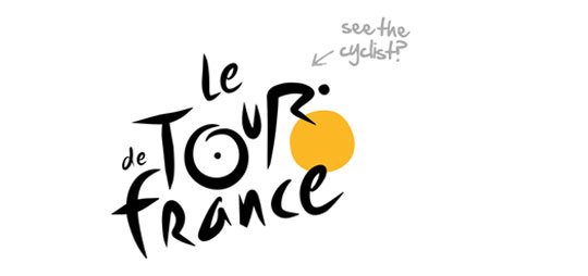
The logo of the Cycle race event ‘Le Tour de France’ is an impressive example of the logos with hidden meaning. Designed with custom made handwritten fonts; this logo design is simply beautiful. Put a spotlight on the letters ‘OUR’ incorporated with a yellow dot. This looks like a cyclist; even the yellow color of the dot has a meaning too; yellow was the color chosen for the famous jersey given to the winner of the race event.
Sun Microsystems
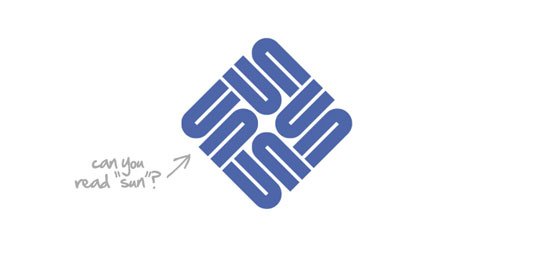
This logo of Sun Microsoft is a combination of typography and Palindromes. Just put a little attention in the design and you will be amazed to see that you can read the letter ‘Sun’ from all the four directions.
I hope that you will like my post on ‘Best Logo Design |Top 15 Creative Logo Designs with hidden Meaning ‘. If you had come across some more creative logo designs; you can share these with us. I will appreciate your reviews and comments about my work .
Keep tracking Webgranth to get updated with the Gyan (knowledge) for web developers and designers.
