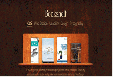
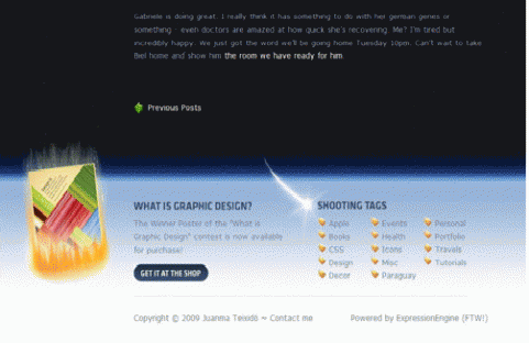
Make your website more attractive and interesting by adding website’s footer to direct the attention of visitors over other areas of your site. Oftentimes, majority of web designers are using the bottom Footer area for navigation purpose and provide users with some common information like copyright, “back to the top” link, contact details, telephone number, a web form, an e-mail etc.
What is Footer?
The footer on web page is an insignificant piece of design that has been originally evolved from a simple section of a website located at the bottom and this space has been frequently used to display copyright information, terms and conditions, contact forms, multi-functional sections and other additional links such as twitter updates etc. A footer design contributes major role in enhancing total presentation of a website and making it more aesthetically appealing. However, designing of creative website design with great header and footer design is not as simple as it sounds.
There are “n” numbers of possibilities are that can be used to make footer design more appealing and informative. In most of the sites, web designers are showcasing their creativity in website footer design to enhance the overall appearance and total presentation of a web portal. Besides visual appeal, footer area can be used to display contact information, copyright information, address, sitemap, main sections, RSS-feed, vivid images and cartoons, high contrast to colors, funny characters, mascots, illustrations, e-mail-subscription and tag clouds.
Useful website footer design tips
Below, some regular useful tips for great website footer design have been discussed. Take a look :
- Add a clean and high-contrast text with large headlines to make your website’s footer design more easy-to-scan.
- Divide the footer into several columns
- Use easy-to-read fonts
- Colors contrast complementing overall website layout
- Design of website – bottom Footer as a visual
- Use social media icons such as Twitter and Facebook
- Don’t forget to add copyright line at the bottom
- Add recent news updates or Twitter feeds
- Try to use relevant Subject matter only
- use the footer area to place logos
Showcasing Best Examples of Website Footer Design for inspiration
In this post, we have collected really best examples of website Footer design as a spoon of fresh inspiration for web designers. Here, we have tried our level best to put together best collection of inspiring website footer design. we have compiled different styles of website footer design by which you can make your website Footer design more appealing and noticeable. Hope, this collection of awesome examples of interesting website Footer designs will definitely bring to you some really great ideas for your footer design. Enjoy!
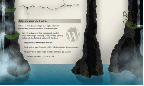
KULTUR BANAUSE
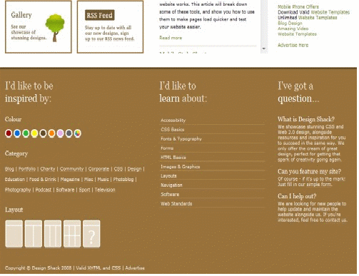
DESIGN SSHACK
REALMAC SOFTWARE
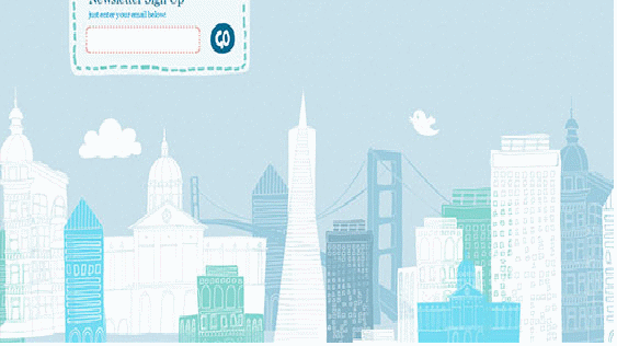
CHRIP TWITTER
READY MADE DESIGNS
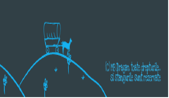
MBDRAGAN
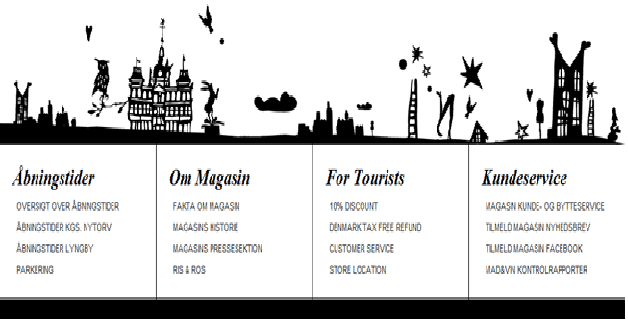
SHOP MAGASIN
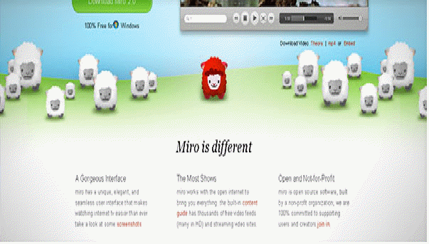
GETMIRO
EVENTS CARSOMIFIED

KITFOLIO
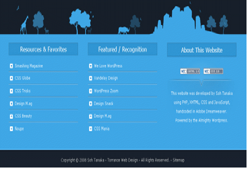
SOHTANAKA
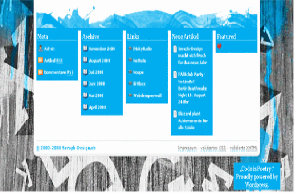
SERAPH DESIGN
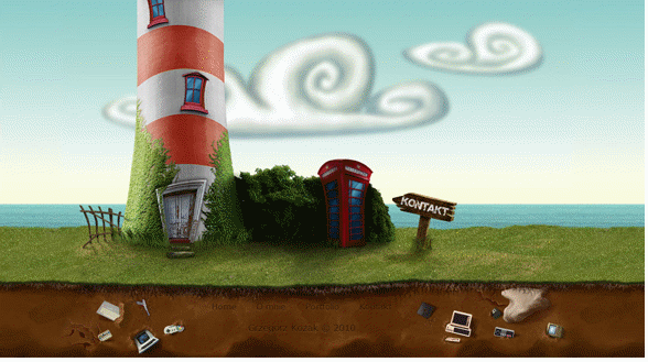
GRZEGORZKOZAK
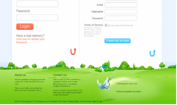
TWITTER DESIGN
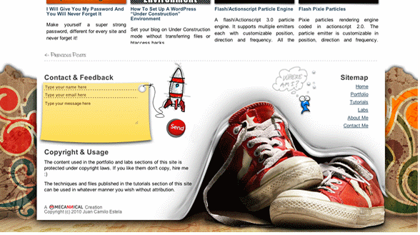
MECANNICAL
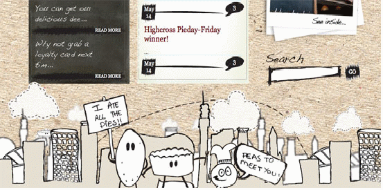
URBANPIE
SAW YERHOLLENS HEAD
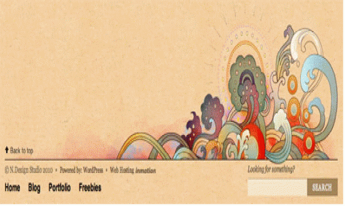
NDESIGN STUDIO
COOPER LIVE
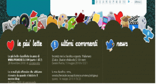
IPRIMIDIECI
TWITHER
CREAMY CSS
TT THINGS

