Flash as a technology is much more than just showing videos and other animation effects for creating stunning visual experience and incredible user interaction. However, Flash based websites is surely not an effective design medium when it comes to usability and accessibility of a website. But, Flash as an incredibly interactive medium has many value-added advantages that cannot be neglected.
Flash-based websites are the beautiful masterpieces create by using Adobe Photoshop and powerful Flash technology creatively to add more realistic and fantasy look to the website content. The major advantage of Great Flash-based websites is that they require less bandwidth and load much faster over the browser. Besides that, Flash enabled web portals allow for a smooth interaction between web pages and visitors.
Most of the Flash designer and developers are using extremely vibrant approaches to add those fascinating flashy and animated effects to his design work. One should always follow usability and user interaction guidelines while applying right mixture of graphics, video and sound, stunning visual elements, animation effects to create outstanding and beautiful Flash-based designs.
Some Common Mistakes to be Avoid
Adobe Flash, a powerful multimedia platform frequently used by web developer and web designers to add special animated and flashy effects. There are some common mistakes to be avoided by every designer and developer when working with Flash Based websites. Let’s have a look to mistakes.
Mistake # 1
Avoid using Flash technology for imitating (X) HTML / CSS based presentation. The reason is simple – it’s bit difficult to work with embedded content of the site in Flash and so, designer and developer should always say NO to Flash when it come to embedded long texts in Flash movies. Besides that, the major issue is that visitor cannot copy and select the content of the website.
Cubamoon , is the best example of wrong use of Flash technology embedded in website content. However, website is perfect and enviable when it comes to design completeness and Flash effects but content of the website cannot be selected or copied.
Mistake # 2
When talking about navigation menus of a design, you should keep three things very clear in mind – design should be intuitive, easy-to-use and work properly. No matter which technology has been used. A design must be a perfect balance of usability and creativity. One should always remember that applying too many creative approaches maximizes the risk of confusion which ultimately irritates visitors. So, designer and developers should always use creative approaches keeping visitors into consideration always.
Mistake # 3
It’s hard to believe but pop-ups are still exists and used. Come on designers. It’s time to avoid pop-ups. At present almost every web browser backed with features blocks opening windows and so, no tricks and convincing arguments will be going to help you now.
Best Examples of Outstanding Flash-Based Websites
In today’s post, we are going to present a beautiful collection of creative and interactive Flash based websites. In the showcase below you will find some really outstanding Flash enabled web portals designed by creative designers. We hope this fantastic collection of Flash websites will serve you as a fresh source of inspiration helping you with your future works.
Custom Design
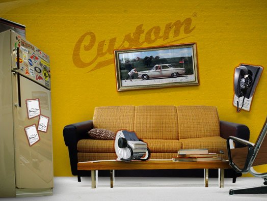
Mood Builder

Ihuvudetpatoyota

Wm team

Agency Net
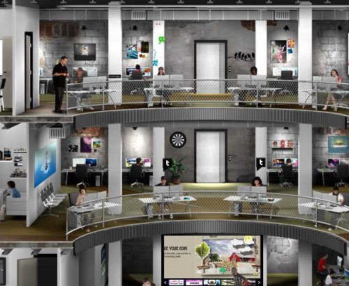
2advanced

Dead-line

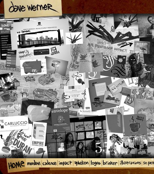
Okaydave
Cafeonique

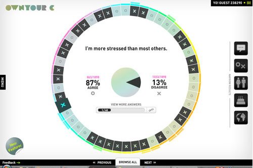
Ownyourc
Designsul
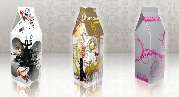
Paregos
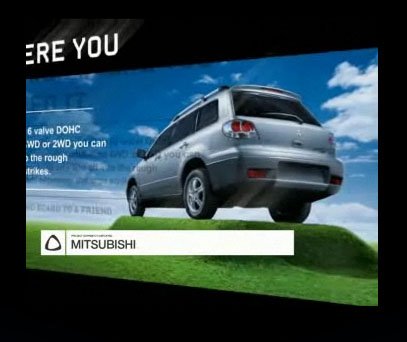
Prismgirl
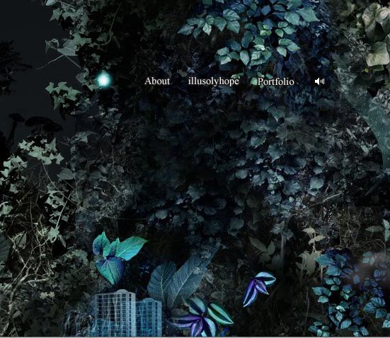
Quake Quizsf

NCK
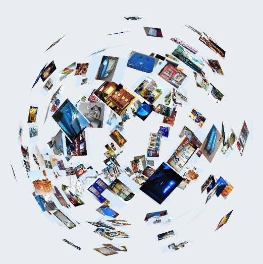
Nespresso

Gotmilk

Real Casual

Vegaone
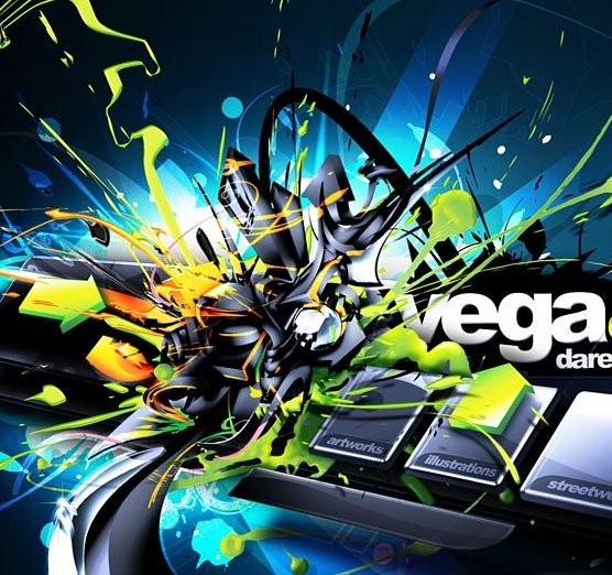
Martini Asti

v5 Design

Sensisoft
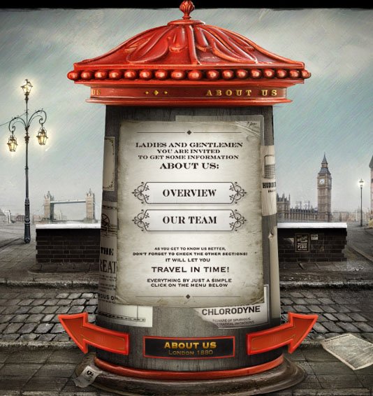
Ari´s Labs. The Digital Home of Graphic Designer Ari Hirvonen


Comments
0 comments