Pricing pages are very common for sites help in encouraging the targeted set of visitors to take action. As per the latest interesting trend, modern web designers are experimenting with pricing page design and trying to come-up with creative designs are applying different approaches to decorate pricing pages of a website. However, creating pricing tables of a website are seriously challenging from both a design (colors, style, typography, icons) and usability standpoint.
A company should carefully pick up and identify the most important features and present them in pricing plans. Always try to entertain your website visitors with the slot if information they would be interested in such as available features, options and costs. Avoid placing unnecessary cell in pricing table because such practice can confuse your visitors and become major reason for their turn-off.
Some Best Practices and Important Guidelines for Pricing Page Design
Creating a pricing table design for a website is not as simple as it sounds. It is important that designer present information effectively and exposing as many features as possible in the pricing table clearly and precisely. A pricing page design should be easy and intuitive so that a user can understand it properly and take any decision. Below are some important factors to be followed to design an amazing pricing table design:
1. Communicate information clearly and precisely
Most of the people think that a pricing table with lots of features and aspects leave good impression on the mind of potential customers. Please note that a visitor always try to read and absorb all the information appears on the pricing table. So, you should always try to communicate not too much information but not too less details. Put only those details which customer wants to look.
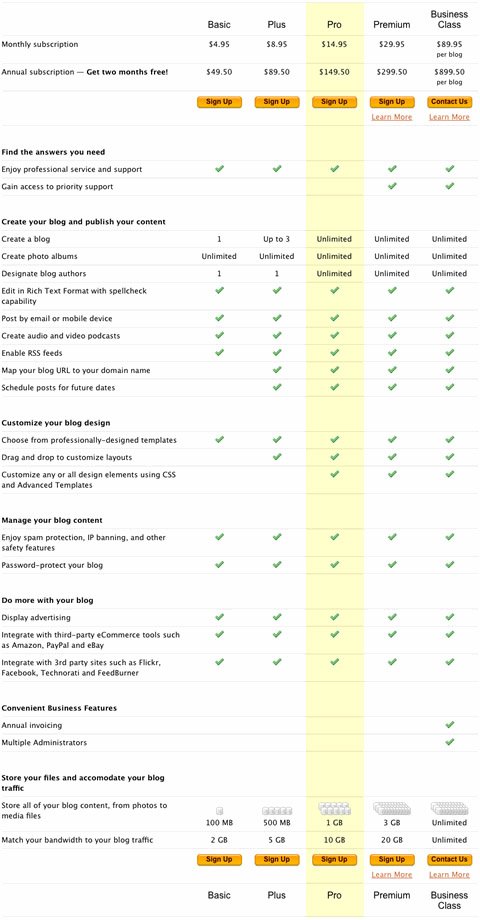
TypePad is the best example of a quite lengthy pricing table we have stumbled upon. However, when you go through the table then you find it really informative. But, the major issue with it is that it is really hard to scan.
Here is the another example of a beautiful and informative pricing table .
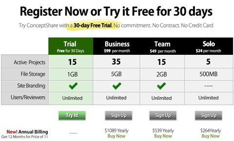
ConceptShare which is short but concise.
2. Illustrate vividly
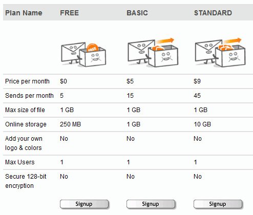
Interestingly, some web designers are making prominent use of illlustrations and vivid images to convey visitors’ difference between various plans such as things like “lightweight” box with tools, metaphors for example cartoons etc.
3. Explain differences rather than similarities
It is often a good idea to focus on communicating difference rather than displaying similar features of the plans. Try to display distinguish between similar features and special features. Place list of distinctive features at the top and common features at the bottom of the table. Have a look at eTribes.com’s pricing table where all differences are conveyed to visitor effectively along with additional information.
4. Avoid Vibrant Visuals
Unfortunately, most of the pricing table designs we stumbled upon have one major problem of using overly vibrant visuals for wrong purpose. Web designers take help of green colored check marks and red crosses to make pricing plans look more attractive and effective. Please note that if we use such icons across the table for each additional feature then it probably becomes bit difficult for users to read it and identify differences between numerous available plans.
Take a look of Beanstalk where all the details conveyed effectively to users by a neutral circle.
Planhq.com has taken advantage of green coloured check marks instead of red crosses.
Here is an another example of amazing pricing table. Goodbarry.com has indicated important details in the pricing table by using green color. Notice that how they used different font-size to showcase different pricing plans in an identifiably distinctive manner.
5 . Make Price Tags Noteworthy
Needless to say, price tag is the first and foremost thing that visitors want to look for across the price table page and so, you cannot afford to ignore it. Unfortunately, most of the B2B and B2C websites used to leave it out which is one of the biggest design mistakes. Try to come out with a consistent price page design which stand-out strongly from both visually and semantically standpoints.
Make the pricing web page noteworthy enough so that your visitors scan website quickly and get information clearly. You can make pricing table of product or service offered attractive by using larger the font size of prices, titles and important headlines. You can even sort pricing plans in table from highest price tag to lowest one or vice versa. Most visitors used to scan a website page in an F-shape and so, it is advisable to place the most cheapest offers on the table’s left side to make your users see the most attractive offer first.
Showcasing best pricing page designs
In today post of Web Granth, we are going to see some of the nicely designed pricing pages. In this collection of pricing design packages, you will find the new, highly-creative, beautiful and unique design styles for creative pricing table presentation. We hope these amazing pricing table page designs stimulate your creativity and inspire your imagination with some really great ideas.
Let’s look at some examples.
ExpressionEngine
Zoho Projects
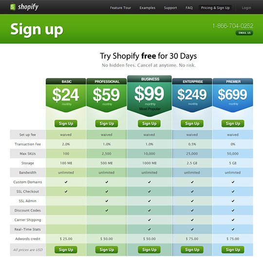
Shopify
activeCollab

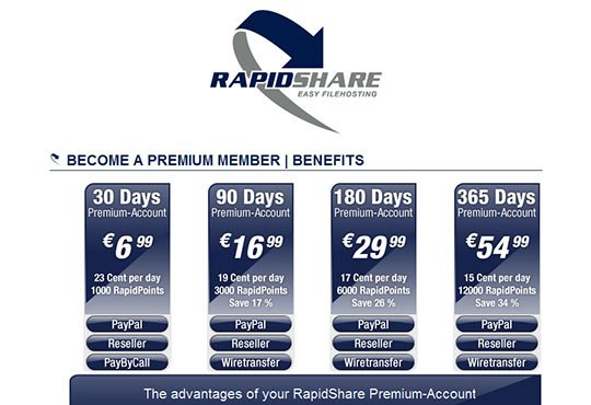
Rapidshare
DabbleDB

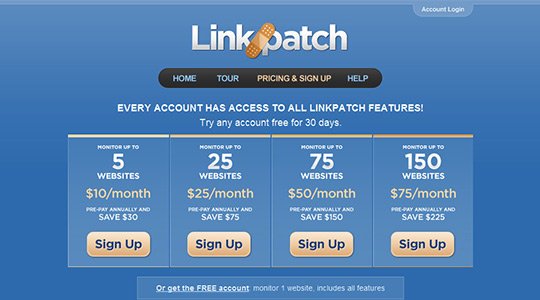
Linkpatch
Jigsaw
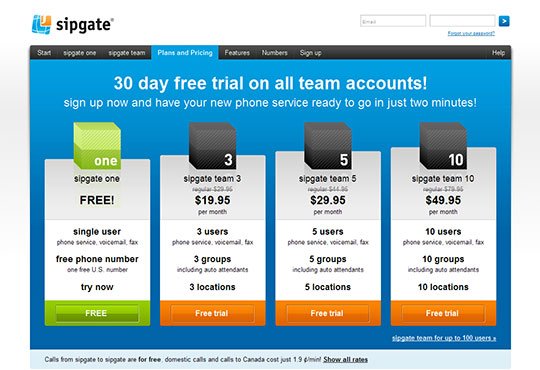
Sipgate
Fluxiom
Mailer Mailer
Volusion
Web-o-matic
Cobblestone
ActionThis
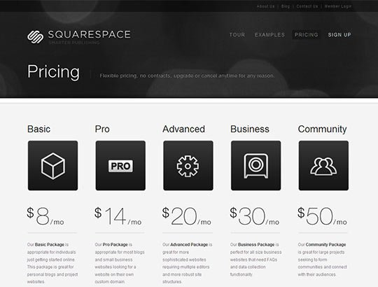
Squarespace
