Microsoft is a great example of this – when they first started out their only real product was Windows, and they were small and nimble. Now their product range has changed massively, from mobile phones to video game consoles, and so the logo they started out with all those years ago is most likely not the right choice were it to be designed again today.
Other times, of course, design trends change, and what was once fashionable now looks dated. Companies like AT&T and UPS are great examples of brands who had a great design at the time, but where the design did not age well, and so a redesign of the logo was required to bring them back up to date.
We’ve brought together a showcase of beautifully designed, creative brand redesigns – some created and implemented, others offered as an unsolicited concept – to help give you some inspiration for your next logo and brand redesign project.
USA Today

USA Today, the popular US news company, is an example of a company whose had a logo design that’s very recognisable, but unfortunately also quite dated. The image of the globe has a bit of an 80’s retro feel, and the kerning on the typography makes the letters appear scrunched together. The proposed update to the logo uses typography that’s more readable with more room to breathe, and a stark, single, minimalist blue globe. The different sections of the paper, such as travel or sports, will incorporate the circle, but can include images or different colours within the shape. You can find the full details on the USA Today rebrand here.
StumbleUpon

StumbleUpon, the entertainment platform that helps users find interesting, new content, has also gone down the route of having a more minimalist brand mark. The colour choice has changed and the SU image has been simplified to bring it more up-to-date with current trends.

Google updated their logo in 2010 with what appears to be a very minor refresh on the surface, but is actually quite an important one. The older logo had some elements that were getting quite outdated – the heavy drop shadow in particular, and the refreshed logo helped to keep it cleaner and simpler while maintaining their playful and fun image – the colour choices were made slightly brighter and more vibrant, for example.
Starbucks

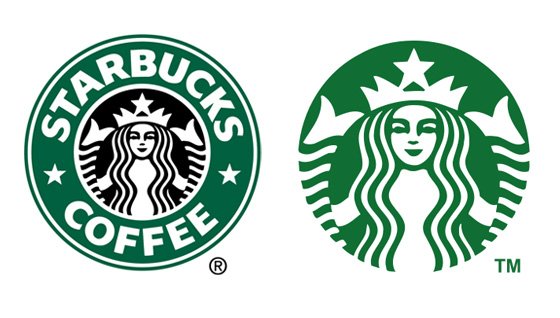
The world famous coffee chain Starbucks bravely played on their fame in their latest rebrand, and also partly went back to their roots, by putting the mermaid image (which was the feature of their original logo back when they first started) front and center on the design, and removing the “Starbucks Coffee” text. This is a brave move from Starbucks – so strong is their brand recognition that the image of the mermaid alone is enough to let you know who they are. The design itself also uses a brighter, more vibrant green – a move away from the darker, muted green of their previous design.
AOL

AOL has been around since the dawn of the Internet, and it’s also suffered from some seriously dated logos. It’s latest rebrand has helped to add some energy and excitement into it’s mark. Now it uses a much cleaner, simpler slab font overlaid on top of a series of different images – ranging from clouds to goldfish to scribbled artwork. It’s a move that works surprisingly well and means that the brand mark can be recognisable even if the image is wildly different from one day to the next.
eBay

eBay, like AOL, has been around since almost the start of the Internet and as such it’s colourful, cheery but somewhat disorganised and chaotic logo has become iconic. Their latest refresh goes down the Google route of remaining colourful and bright, but aims to bring some calm and order to things. It’s no longer a jumble of letters – the characters don’t overlap anymore, you might notice – they merely fit together perfectly. You can read more about eBay’s rebrand here.
Cisco

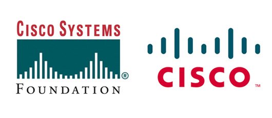
Cisco Systems has always had a reference to their hometown of San Francisco within their logo, as well as in their name, as the raised bars of signal in tge design represents the Golden Gate bridge. Their old logo, however, was quite stern and perhaps a little too corporate. The new rebrand helped to show Cisco as being a bit more playful and having a bit more personality – and the minimalist effect also manages to keep the reference to the Golden Gate bridge, while the heavy slab typeface is given a bit more room to breathe with a greater level of kerning and whitespace.
Hewlett Packard

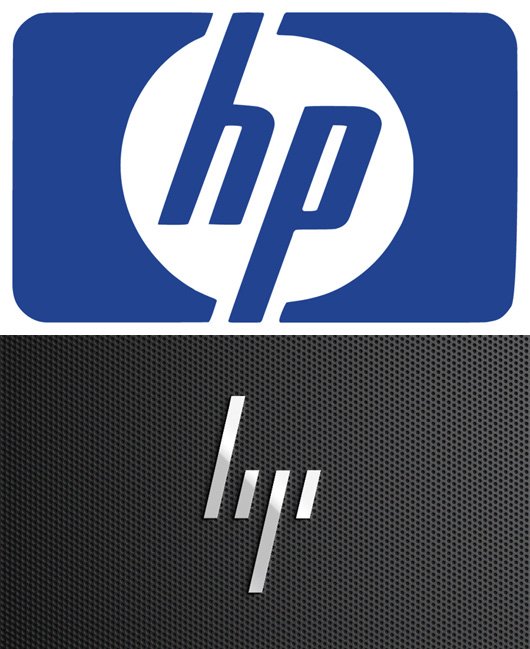
Tech company Hewlett Packard has been around for years, and it’s logo is dated and uninspired. The rebrand for the logo was created by design agency Moving Brands, but was sadly never brought in to replace the older design. The idea behind the concept for Hewlett Packard’s newer design is that HP’s well known logo features a 13 degree slant. The new design includes a subtle hat-tip to the older design by also using a 13 degree slant, but brings it up to date with an ultra modern, minimalist and cleverly simple style. The new design is made up of just four lines, and despite the simplicity behind it, it’s still easy enough to see the lowercase letters “hp”.
Have you found any examples of beautifully designed, thoughtful and creative brand redesigns? Please do let us know in the comments.
About Author:
Alex writes for Print Express, who specialise in business cards, flyers & postcards. In his spare time he studies graphic and web design and enjoys learning to code.

Comments
0 comments