Find the right web design resource to interpret these jargons!
In this article, I have put together 20 mind-blowing designing terms for new or inexperienced customers.
White Space

White space is the space between objects drawn, figures, graphics, lines of type and columns. It is often referred to as negative space. It is an important web design element which exposes the objects in it. Hence, white space should not be considered merely as “blank” space.
Transition
A web design technique used to create visualizing simple changes that help users understand the flow and pace of an interface. Clever transitions offer instant feedback to a user, an aesthetic reward for the desired action. Transitions are often used by designers to reveal features as the user needs them.
Infinite Scrolling
Infinite scrolling is a web design technique that is used by many web designers to enhance user experience. It saves the user from loading different pages by putting everything on one page. New data unveils to show different content areas as the user scrolls down.
Visual hierarchy
Visual hierarchy is the art of placing some design elements over others. It is often used to define Information Architecture process. Visual hierarchy is normally achieved through the use of font, color, size and special effects like drop shadows.
Server-side scripting
A generic term used to describe the languages used for data manipulation on the server. It uses languages like ASP and PHP. The user’s web browser doesn’t have to work so hard because the processing is done on the server.
Information Architecture (IA)
A term used in web design to describe how a website is organized. It refers to the organization of the content, dealing with what content is contained on each page, what pages go where in a website structure. It aims at increasing user satisfaction, revenue, and conversion.
ARIA
ARIA stands for Accessible Rich Internet Application. Basically, it is used to describe the technologies implemented to help narrow the gap between web app or a website and the user’s needs. It aims at increasing website functionality and the accessibility of content.
A/B Testing
A/B testing helps designers test web-pages in different versions. It entails using alternative layout to track how many users convert to buying customers. A/B testing helps you as a designer experiment the most effective solution in achieving the same end result.
SaaS
SaaS is an acronym for Software as a Service. It should not be confused with SASS; SaaS describes everything from Photoshop Express to Google Docs. The services are delivered via or from the cloud. The user doesn’t have to install any additional software since the services are delivered directly from the web.
Responsive design

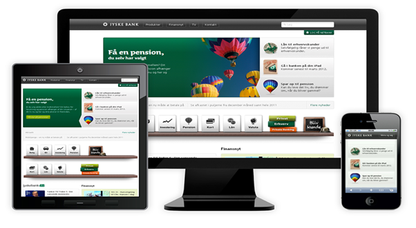
Responsive design is a common term amongst web designers. Nowadays, you have to be keen in designing websites to ensure it is responsive when accessed through a range of devices. For example, a responsive web page should display as a single column when viewed on a Smartphone, but in multiple columns when viewed on a desktop.
JavaScript
As implied by the name, JavaScript is a scripting language that is used by designers to create interactions on a web page. It can be used for various uses, including loading new content without reloading the whole page or the ability to give special visual effects.
CSS
CSS is an acronym for Cascading Style Sheets. It comes in handy to help designers create awesome pages, given HTML alone can’t create beautiful sites. CSS allows things like the position, the shape, the size, the background and the colour of all the different parts of a page to be well-organised.
HTML
HTML is the language of the web. It stands for HyperText Markup Language. It contains different tags that allow you to mark up your content with semantic meaning. HTML provides us a way to communicate with our web browsers on how to handle a particular piece of content.
Mockup
Mockups entail the actual size models of how you would like your end product to look like. Mockup often lacks the functionalities of the intended page but they will be nearly identical to the actual page or website.
Textures

They are repetitive themes that are used by designers to create a given look on a website. Textures can be very boisterous or very subtle, depending on your website’s style and purpose.
Single-Page Sites
Many clients are used to websites that have several pages with a certain navigation menu to move around the website. Well, single-page sites literally have only one page.
Landing page
A landing page is a web page that is meant for a specific business purpose. Historically, it was used to describe any page where visitors entered while searching online.
Above the Fold
It is another mind-blowing term that is common to marketers and designers who work with online platforms. Above the Fold is the space that designers use to position their most important pieces.
Masonry Grid

It is a web design technique that lets designers arrange content into a grid layout. The end result portrays a neat and organized look of content fitting into the grid.
Metro Design
The design was originally developed by Microsoft and it is applied on many products released by the company. It is also known as “Microsoft Design Language”.


Comments
0 comments