No wonder, many retailers are shutting shop and shifting to online commerce completely. However, an increasing number of online shoppers does not mean that every e-commerce site is profitable. According to stats, on an average, only 2.86 percent of e-commerce visitors end up buying something on a website. In other words, only 1 in 34 visitors purchase something on your site, and that’s considerable loss of revenue!
Optimize Your Product Pages to Boost Sales
For any online business, it takes a lot of planning and strategy to drive traffic to their website. However, despite the amount of time and effort spent in generating traffic, it isn’t enough to generate sales.
Do you know why?
Because most product pages are not optimized for conversions. Yes, when a customer finds you and reaches your product page, he or she is clearly interested in your products. However, if your product page does not showcase enough information about your products or contains poor quality pictures or does not offer live chat support, visitors won’t think twice before switching to another retailer with better product pages.
And, you don’t want that to happen, ever!
But don’t worry; there’s a solution to every problem. That’s exactly why we have created this handy guide with quick tips to help you optimize your product pages for more sales and profits.
Know Where You Stand
Or, analyze your product page to identify the elements that need to be worked upon.
A good product page must possess the following key features:
- The product, presented in an aesthetic way.
- An attractive design.
- Bring your brand voice.
- Useful and informative copy.
We suggest that you start by spending some time on your product page to figure out what’s great and what needs to be worked upon. Check for the following, in particular:
- Your page possesses an attractive, informative, and clear design.
- It loads fast, without much wait time.
- The products are presented impressively with high-quality photos and videos.
- You have used a compelling copy to describe each product on the page.
- Visitors can contact your support staff directly from each page to seek information or help during checkout.
In case, you find your page doesn’t deliver on the above criteria, you could follow the tips we have shared below to optimize your page for more sales:
1. Use Professional Photographs
What do you do when you walk into a retail store? You compare various products by touching or trying them out before deciding whether to buy something or not. However, online shoppers cannot touch, feel, or try the products online. That’s precisely why clear, aesthetic, and professional photographs are essential to highlight your products on your site.
Here are some proven tips to optimize the product images for your page:
- Use High-Quality Images – Custom product images that show-off your products aesthetically are vital to make the right impact on visitors. We suggest that you use high-quality photos clicked with an advanced camera while making sure that all the images on your page are of the same size and quality.
- Use Multiple Images of a Product – Stats indicate that up to 33.16% of customers prefer to view multiple pictures of a product before making a purchase. Take advantage of this fact by uploading several images of each product, showcasing every angle, to help visitors understand the product in detail.
- Showcase every Variation – In case, you have several variations (for example, colors or pattern) available for a product, don’t forget to add an image for every version instead of including a small tab listing the colors or patterns.

H&M does it right with all the colour options presented properly
Image Source
- Add Zoomable Images – While your users can’t touch or feel a product, zoomable and detailed pictures provide them with an accurate idea of the texture of the product, making it easier to take a purchase decision.
- Use Contextual Pictures – “Will this dress be too long for me?” This is just one of the many questions that buyers think of while shopping online. However, good retailers make it easier for their customers by sharing contextual images on their page. For example, if you are selling clothes, it makes sense to showcase a piece of clothing on models of varying heights to give customers a better idea of how it might look on them.
- Use 360-degree videos – Stats reveal that 90% of people find product videos extremely helpful during the buying process. Using 360-degree videos on your site gives customers a better understanding of your products, increasing the likelihood of sales. Data indicates that 64% of consumers are more likely to buy a product after watching a video.
2. Offer Live Support
The world of e-commerce is highly competitive, and businesses must offer something extra to attract and retain their customers. One such idea is providing the users with the ability to live chat with your agents directly from the product pages.
A study indicates that 44% of consumers appreciate the option to be able to talk to an agent in the midst of an online purchase. With live chat, visitors can directly connect with your agents to have their queries answered in real-time and make immediate purchase decisions. In case, there is no live chat support on your product pages, your visitors are likely to abandon the site due to lack of information.
Besides providing immediate service and reducing support costs, live chat also allows you to offer a high degree of personalization and warmth in your customer communications that boost customer engagement and loyalty.
3. Create Social Proof for your Products
Inc.com shared an insightful article on the relevance of online reviews in which it shares the following stats:
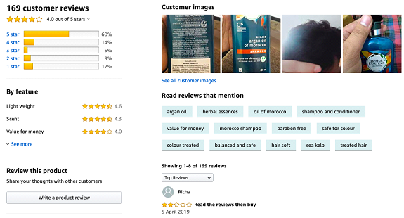
“Research shows that 91 percent of people regularly or occasionally read online reviews, and 84 percent trust online reviews as much as a personal recommendation. And, they make that decision quickly: 68 percent form an opinion after reading between one and six online reviews.”
Clearly, online reviews matter, and it is not surprising because customers have no way of telling if an online product is good, bad, useful, or a waste of their money. However, customer reviews provide a reliable source of information, enabling users to make educated decisions.
So, if you want to build a high-converting product page, encourage your customers to post reviews by sending up a follow-up email asking them to rate or review the product.
Of course, not all the reviews that you receive would be positive. But, you can use the negative reviews to your advantage by answering them with empathy and professionalism and solving customers’ problems as soon as possible.

Do you read reviews before you buy?
Image Source
4. Use Creative, but Intelligent Copies
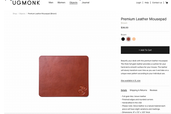
It is essential to use short, crisp, meaningful, and creative copies to describe your products. Besides, it is important to avoid long sentences, cheesy copies, and complex vocabulary to keep the text readable and easy to understand.
Here are some tips for structuring your product copy:
- Keep your descriptions short and sweet
- Use keywords to optimize the content
- Follow a clear structure with headings and bullets for better comprehension
- Add specific details for more informative copies
In addition to your product copy, it is imperative to mention the price of your products clearly. You can place the price near the CTA, which must occupy a prominent place on your page to direct the users to the next step.

Simple and Lucid Product Descriptions
Image Source
5. Optimize Your Product Pages for Mobile
Mobile is the future of e-commerce, and that’s a fact. According to stats, 79% of smartphone users have bought something online using their mobile device in the last six months. And, up to 80% of shoppers use a mobile phone, while shopping at a store, to look up product reviews, compare prices or find other store locations.
In 2018, even Google recognized this growing trend and announced a mobile-first indexing update.
But have you optimized your product pages for mobile yet? If not, your mobile-unfriendliness could be the proverbial leaking bucket for your business, leading to immense loss of profits.
You can also consider a shopping app for your business to provide better user experience and facilitate faster checkouts as compared to mobile sites.
The Wrap-Up
Establishing an online business is easy; all you need is a great idea and a little bit of capital, and you are ready to go. However, next comes the problem of lead generation and conversions.
Fortunately, most marketers have mastered the art of generating high amounts of traffic. Yet, many e-commerce sites record a dismal conversion rate on their product pages due to one simple reason – lack of proper optimization. So, if you wish to make your e-commerce business successful, don’t forget to structure your product pages well and use the simple tips we mentioned above to improve your conversion rate significantly.


Comments
0 comments