Website navigation is the essential element stands out as a main cornerstone of a website required to organize, arrange, and display content of the web pages to users. A consistent navigation menu is a functional yet visually impressive element in the website design used to provide website visitors some sense of guidance to browse through the web pages. A simple and calm but interactive navigation menu does make sense in comparison to dynamic one. Don’t forget users simply want to use your website and expect user-friendly and usable website navigation.
In web design industry, the designing part of navigation menu of a website provides web designer’s creative ability a new window to create a outstanding navigation design that sustain user’s interest. To create interesting navigational menu designs, most web designers taking help of JavaScript libraries like jQuery to add animation effects to navigation design for smoother and richer user experience.
Latest Trends in Navigation Menu Design
Here, you are going to explore latest trends web designers following to create the design of a navigation menu.
3-D Navigation
3-D navigation is the most commonly applied trend towards navigation menu design elements. Have a look to Delibar website screenshot where content areas appear very much similar to piles of paper pieces along with navigation items. Here, JavaScript effect has been used to move piles smoothly whenever user hover over the navigation items.
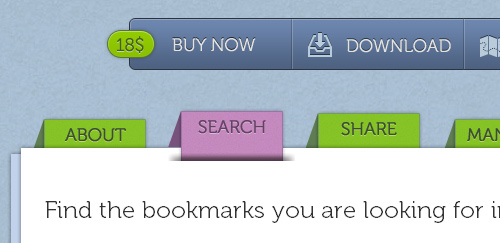
SOURCE: http://www.delibarapp.com/
The navigation bar of Blue Door Baby is another example of 3D navigation where you can see that ribbon like thing has been used to style the navigation bar. Here, the ribbon is beautifully laid over top of the feature area. The menu items in navigation bar are text-image replacements contains an inset-text effect.
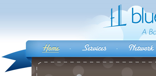
SOURCE: http://www.bluedoorbaby.com/
Speaking block
In web design industry, most creative designers attempt to speaking navigation instead of silent navigation. As per this upcoming trend, designers trying to communicate menu bar content with explaining with a more effective dialogue based upon keywords list.

SOURCE: http://www.rakacreative.com/
![]()
SOURCE: http://pixelresort.com/
Speech Balloons
Another popular trend we have come across is creating navigation menu items in speech balloons or bubbles shape. Most of the web designers consider speech balloons or speech bubbles one of the best design option to break the old trend of conventional rectangular menu.
Alexarts is the best example of navigation menu items designed in speech balloons.

SOURCE: http://www.alexarts.ru/en/index.html
Kingpin Social
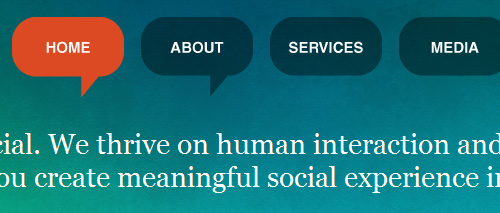
SOURCE: http://kingpinsocial.com/
Tienda

SOURCE: http://www.pampaneo.es/tiendastore.html
Contrast

SOURCE: http://www.contrast.ie/blog/
Rounded corners
From past few time, design trend of rounded corners of soften sharp rectangles mainly carried over from call-to-action buttons to navigation menu bar items. Take a look to some of the examples:
New Look Media

SOURCE: http://newlookmedia.com/
Ballpark

SOURCE: http://getballpark.com/
MetaLab
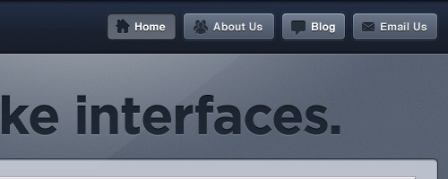
SOURCE: http://www.metalabdesign.com/
Icons
Web designers using visually appealing icons in navigation bar of a website. Icons in navigation bar are increasingly being popular trend in web design industry. Such practice help in creating a visual recognition among users. If you opted to use icons in navigation bar then make sure that it’s loading time is short to make the page more responsive. Appealing icons are best option for navigation as the icon is more easily recognizable. Here are the examples with best approaches.
At mesonprojekt , you can see hand-drawn-themed navigation menu include icons.
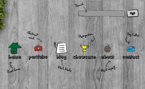
SOURCE: http://mesonprojekt.com
Adii Rockstar

SOURCE: http://adiirockstar.com/
Sourcebits
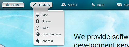
SOURCE: http://www.sourcebits.com/
Tasty planner

SOURCE: http://tastyplanner.com/
JavaScript framework Animation
Now-a-days, most of the web designers have been using JavaScript framework to create amazing animated page elements for navigation.
Take a look to Andreas Hinkel website. Here, JavaScript animation has been used in the primary navigation to move the navigation menu item up whenever visitor hovers over it.
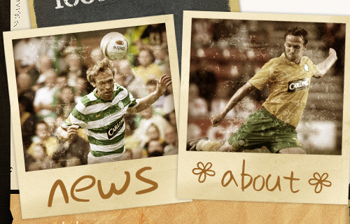
SOURCE: http://www.andreashinkel.com/
Votaw

SOURCE: http://www.votaw.com/
Unusual Shapes
It seems like web designers love to break norms of web design. We have noticed a latest trend of using unusual shapes used to create navigation bar.
Think Up

SOURCE: http://www.thinkup.org/
Custom Tshirts UK
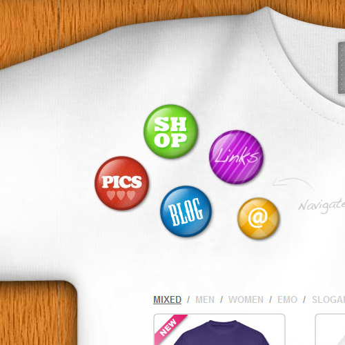
SOURCE: http://www.custom-tshirts.eu/
Booma
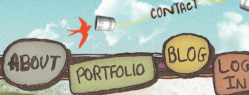
SOURCE: http://www.boomawebdesign.com/
Navigation Menu Designs Showcase – Best Practices and Examples
Below we have put some really interesting examples of beautiful and creative website navigation menus well integrated in website that inspire your mind with creative ideas. Here are some examples.
Mystery Tin
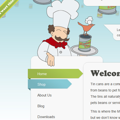
SOURCE: http://www.mysterytin.com/
Loodo

SOURCE: http://www.loodo.com.br/
Sower of Seeds

SOURCE: http://www.sowerofseeds.org/
Design Spartan

SOURCE: http://www.designspartan.com/
Bush Theatre

SOURCE: http://www.bushtheatre.co.uk/
Acko

SOURCE: http://acko.net/
Webdesignledger
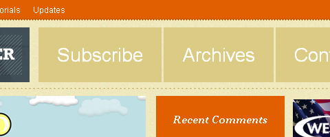
SOURCE: http://webdesignledger.com/
Nopokographics

SOURCE: http://www.nopokographics.com/english/
Smallstone

SOURCE: http://www.smallstone.com/home.php
Clearleft

SOURCE: http://clearleft.com/
Tvrdek

SOURCE: http://www.tvrdek.cz/en
Revolution deriving tuition

SOURCE: http://www.revolutiondrivingtuition.co.uk/

Comments
0 comments