I always overhear people within the design industry tearing lumps out of people who use Photoshop. And to a certain degree you can see why. Many graphic designers overuse and misuse this powerful tool, and despite the fact that it can help to create something truly spectacular, without the proper knowledge and know-how, you can ruin a perfectly good image.
In this day and age we strive for perfection. What we consider to be ‘perfection’ is constantly changing. I’ve always been interested in photography, particularly fashion photography, and Photoshop is a great tool for touching up those miniscule blemishes. However, just take a look at some of the major fashion magazines out there, and you’ll see that in their attempt to achieve perfection, they too have become guilty of overusing and misusing Photoshop.
Whether it’s tweaking the physical appearance of models or touching up the scenery to give that feeling of perfection, there’s no denying that it is often completely overdone. If this is the case, images can appear unnatural and often, down right ridiculous!
Yes, touch-up tools are readily available, but without the skill and attention to detail, you can easily make a real hash of your images.
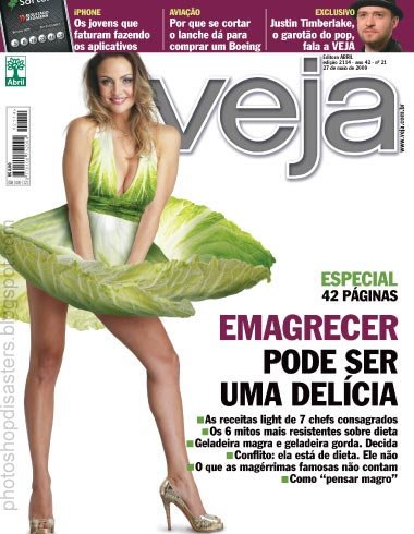
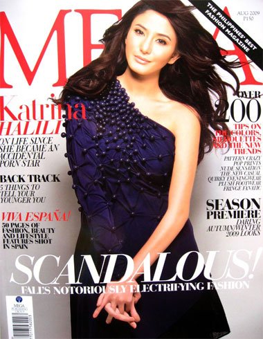
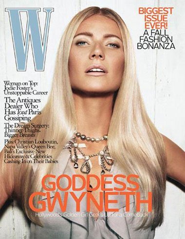
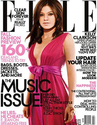
I’ve cherry-picked a few prime examples to illustrate my point. See if you can spot the dreadful Photoshop mistakes in these images.
Pet Vet (Wii Game)

Veja Magazine

Mega Magazine

W Magazine

Elle Magazine

Next time you decide to open up Photoshop to touch up your images, keep these disasters in mind.
Author Bio
This article was brought to you by Barry Magennis – a lover of digital design and specialist in recruiting for graphic design jobs in the UK.

Comments
0 comments